
When I lived in Texas one of my summer traditions was to go to the bookstore (remember those?) and buy the new copy of Dave Campbell’s Texas Football (DCTF) magazine. For those of you who don’t live in Texas or have never seen the magazine, it is a pretty unique publication and the kind that could only exist in the Lone Star State.
Printed on glossy paper and the better part of an inch thick (the 2013 edition is, in fact, 400 pages), the magazine previews just about every high school and district in football-crazy Texas, as well as providing multi-page features on all of the major NCAA teams in the state (and smaller capsules on every other college program as well). So, if you want to know who will be starting at left guard for Gilmer in the coming season, which team looks like the one to beat in 4A District 30 (isn’t it always the Calhoun Sandcrabs?) or how the incoming class for Sul Ross State stacks up, DCTF is your go-to source.
One of the features I noticed in reading the magazine was a simple table in the appendix that listed the number of Division I-A (now known as Division I-FBS) recruits that came from each state for the prior recruiting class. Being both a recruiting nerd and a bit of a numbers wonk, I was always fascinated by this list. I can’t recall ever seeing that same information summarized in the same way anywhere else. It was an invaluable weapon in jousting for nerd supremacy on recruiting web sites during my obnoxious stage in the early aughts.
I recently decided to use this knowledge for good instead of evil, and to answer once and for all the (in)significant questions that plague the fevered minds of all true college football junkies during their frequently sleepless nights. Fortunately, the good people at DCTF were nice enough to force some poor intern to go through old magazines and tabulate data for me to torture analyze.
The Big Three
If I told you that Texas, Florida and California produced the most FBS recruits every year, you’d probably say something like "duh". After all, they are three of the four most populous states. It should come as no surprise that the other mega-state in terms of population, New York, doesn’t come close to challenging them. What might come as some surprise is that New York falls well short of Utah in the production of major college football players. But more on that later.
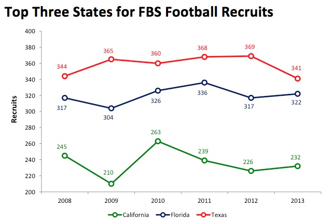
Of slightly more interest is the relative stability of the numbers. The totals bounce around, but over the period for which I have data (it was provided to me back to 2005 for the top states, but DCTF inexplicably did not publish this crucial list in 2007) there is no discernible trend evident for any of the Big Three.
The sheer magnitude of the numbers is also impressive. The national average signing day class is a fraction over 19 commits (and also very stable), which means that Texas annually produces enough players to fill about 18 recruiting classes, Florida produces enough for 16-17 average classes, and California kicks in another twelve or thirteen. Combined, the Big Three have produced just under 40% of all FBS signees over the past six years.
Where is the Rest of the Talent?
Football recruits are not distributed across the country normally, or even linearly. As illustrated strikingly above, a few states produce a huge portion of the talent that plays in FBS, while many states produce little (or none at all). Production of players is clearly a function of a combination of population, demographics, and, to some extent anyway, the cultural importance of football within the state.
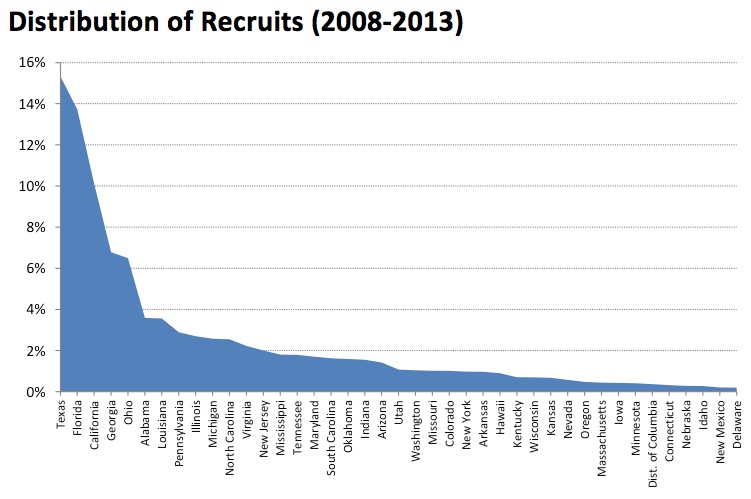
The graph above shows the share distribution of recruits from the states (and the District of Columbia) that matter, even a little. I had to trim off the bottom ten states to get the labels to fit and be legible. Over the past six years, the bottom ten states produced a grand total of nine recruits, or an average of 1.4 recruits per year for all of them combined. Engineers and real statistics experts could probably say better, but it looks a lot like an exponential distribution to me.
The table below shows all of the states that have produced an average of at least 20 recruits per year from 2008-2013. Over that timeframe those 27 states have produced 93% of recruits who have signed Letters of Intent to play major college football.
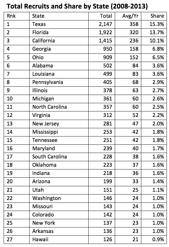
The next five names are probably about as unsurprising as the top three were; they are all populous states in the South or Rust Belt, areas where football is deeply ingrained in the culture. The list gets a little more interesting further on down, with New York and Utah especially standing out.
Per Capita Rates are a Lot More Interesting
Slightly more than 2,300 high school seniors a year sign LOIs to play for football with FBS programs. Based on official population estimates from the US Census, that works out to just about exactly 0.75 recruits per 100,000 population. Based on a 50/50 gender split (and I know that is not exact, but I can only spend so much time digging for data on websites ending in .gov), that is 1.5 recruits per 100,000 males nationally.
So 0.75 per 100,000 is the national average and our baseline. How do the individual states stack up in terms of their production of big time college football players, adjusted for population? I downloaded official census estimates of state populations by year for 2008-2012 and calculated per capita rates for each state. Since the official estimate for 2013 isn’t out yet, I just used 2012 numbers for this year. In order to smooth out the minor noise, I took the yearly average recruit numbers for the last six years and compared it to the average population over that same timeframe.
So which state takes the crown? Louisiana. No wonder LSU seems to reload its talent so reliably as long as the program is run by an even arguably competent coach.
Over the period of study Louisiana produced Division I-FBS recruits at almost two and a half times the national average. It ranked first in both average per capita rake and in median per capita rate, though it didn’t rank first in all years. Alabama is a strong runner up, having ranked first in two years (both 2013 and 2012, so maybe there is a trend starting). The District of Columbia and Hawaii were both wildcards, with D.C. ranking as high as #2 and as low as #10 in individual years and Hawaii ranging from #1 (in 2010) to #9 (twice, in 2011 and 2012).
New York produces college football recruits at the same per capita rate as Wyoming and North Dakota (slightly less than one sixth the national average), which explains (or again, maybe describes is a better word) how a state with almost 20 million people has produced the same number of players as Arkansas over the past six years.
Before fans from Louisiana or any of the other top states get too filled with pride over the position of their state on the list, they should consider the following: in 2013 American Samoa produced seven FBS recruits on a population of slightly over 55,000, for a rate of 12.6 recruits per 100,000 population. That is almost six times higher than the next highest single year rate for any state. Big time college football programs have only been actively recruiting American Samoa for a couple of years (and only a fraction of FBS teams do so); expect to see that trend continue.
| Per Capita Production of FBS Recruits by State (2008-2013) | |||
| Rate per 100K | Rank | vs. US Avg | |
| US Average | 0.75 | ||
| Louisiana | 1.83 | 1 | 2.44x |
| Alabama | 1.75 | 2 | 2.33x |
| Florida | 1.69 | 3 | 2.25x |
| Georgia | 1.62 | 4 | 2.16x |
| Hawaii | 1.54 | 5 | 2.05x |
| District of Columbia | 1.43 | 6 | 1.90x |
| Mississippi | 1.42 | 7 | 1.89x |
| Texas | 1.41 | 8 | 1.88x |
| Ohio | 1.31 | 9 | 1.75x |
| Oklahoma | 0.99 | 10 | 1.32x |
| Utah | 0.90 | 11 | 1.21x |
| South Carolina | 0.82 | 12 | 1.09x |
| Arkansas | 0.78 | 13 | 1.03x |
| Maryland | 0.69 | 14 | 0.92x |
| Tennessee | 0.66 | 15 | 0.88x |
| Virginia | 0.65 | 16 | 0.86x |
| California | 0.63 | 17 | 0.84x |
| North Carolina | 0.62 | 18 | 0.83x |
| Michigan | 0.61 | 19 | 0.81x |
| Indiana | 0.56 | 20 | 0.75x |
| Kansas | 0.55 | 21 | 0.74x |
| New Jersey | 0.53 | 22 | 0.71x |
| Pennsylvania | 0.53 | 23 | 0.71x |
| Delaware | 0.52 | 24 | 0.69x |
| Arizona | 0.51 | 25 | 0.69x |
| Nevada | 0.50 | 26 | 0.66x |
| Illinois | 0.49 | 27 | 0.65x |
| Colorado | 0.47 | 28 | 0.62x |
| Idaho | 0.41 | 29 | 0.55x |
| Missouri | 0.40 | 30 | 0.53x |
| Kentucky | 0.38 | 31 | 0.51x |
| Nebraska | 0.36 | 32 | 0.49x |
| Washington | 0.36 | 33 | 0.48x |
| Iowa | 0.33 | 34 | 0.44x |
| Oregon | 0.29 | 35 | 0.39x |
| Wisconsin | 0.29 | 36 | 0.38x |
| New Mexico | 0.23 | 37 | 0.31x |
| Connecticut | 0.21 | 38 | 0.28x |
| Minnesota | 0.18 | 39 | 0.24x |
| West Virginia | 0.18 | 40 | 0.24x |
| Massachusetts | 0.16 | 41 | 0.21x |
| Montana | 0.15 | 42 | 0.20x |
| South Dakota | 0.12 | 43 | 0.16x |
| Wyoming | 0.12 | 44 | 0.16x |
| New York | 0.12 | 45 | 0.16x |
| New Hampshire | 0.08 | 46 | 0.10x |
| North Dakota | 0.07 | 47 | 0.10x |
| Alaska | 0.07 | 48 | 0.09x |
| Rhode Island | 0.02 | 49 | 0.02x |
| Maine | 0.00 | 50 | 0.00x |
| Vermont | 0.00 | 50 | 0.00x |
I have several ideas of additional directions that I can go with the data. I’m sure that some interesting questions will also come up from readers. Let’s talk about it in the comments section.


